JQuery Datepicker (Calendar)
Getting the JQuery Libraries
-
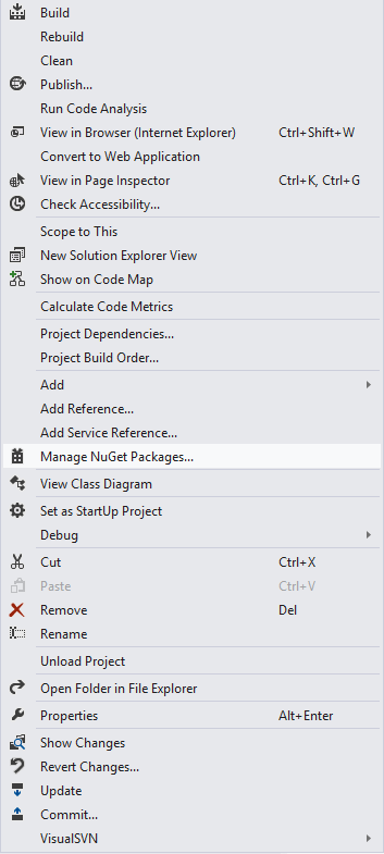
Right click on your project in the Solution explorer and select "Manage NuGet Packages".
-
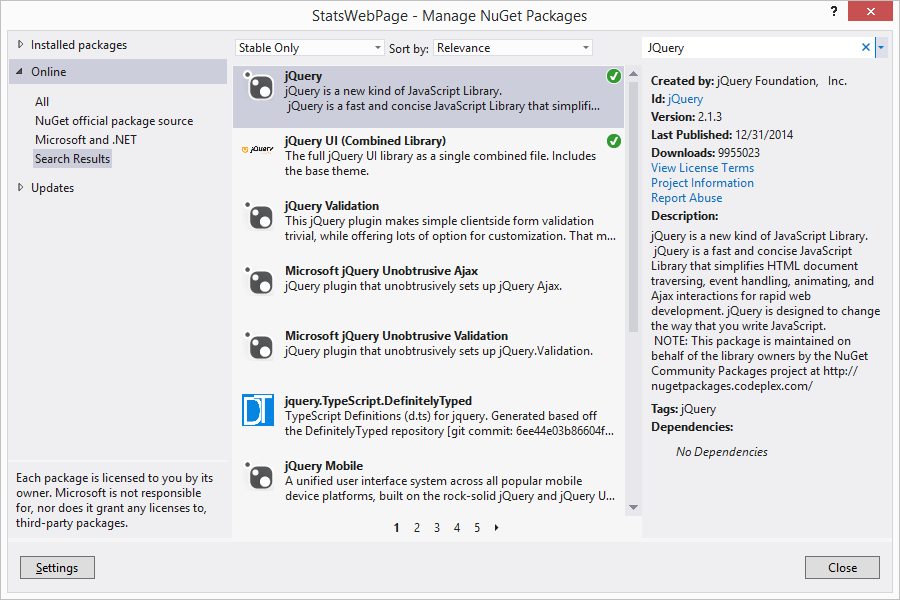
Search for "JQuery" in the search bar of the NuGet Manager.
-
Install both "JQuery" and "JQuery UI (Combined Library)"
-
Include Scripts for both Libraries on your page at the top of the body.
i.e: <script type="text/javascript" src="Scripts/jquery-2.1.3.js"></script>
<script type="text/javascript" src="Scripts/jquery-ui-1.11.2.js"></script>
Adding The Datepicker and Necessary Script
-
There are 2 sections of Script that you will need to have on your page, as well as one input control that will house the Datepicker.
Let's start off with the simple part, the input.
Add an un-typed input to the page and assign it an id. If you wish to be able to access this input from the back-end, add runat="server".
i.e: <input id="myCalendar" runat="server" />
-
Next we will add the script that will call the JQuery to populate the calendar.
Insert the script as shown below. Substitute your own parameters within the brackets.
i.e: <script type='text/javascript'>$(document).ready(function () {$('[The name of your input]').datepicker({ minDate: '[Desired Minimum Date]',
maxDate: '[Desired Maximum Date]' })});</script>
-
The next script section will be used to set the parameters of your Datepicker. The only parameter you will really need to change is the "buttonImage" parameter.
If you have a calendar icon that you would like to use, you will sub it in there.
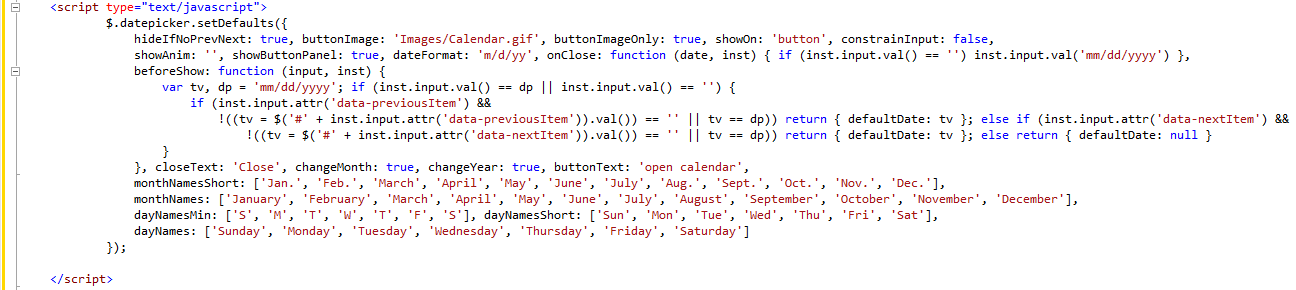
It is a rather large chunk of code, so feel free to copy from below. Substitute your own parameters within the brackets.
<script type="text/javascript">
$.datepicker.setDefaults({
hideIfNoPrevNext: true, buttonImage: '[Your Calendar Icon Image]', buttonImageOnly: true, showOn: 'button', constrainInput: false,
showAnim: '', showButtonPanel: true, dateFormat: 'm/d/yy', onClose: function (date, inst) { if (inst.input.val() == '') inst.input.val('mm/dd/yyyy') },
beforeShow: function (input, inst) {
var tv, dp = 'mm/dd/yyyy'; if (inst.input.val() == dp || inst.input.val() == '') {
if (inst.input.attr('data-previousItem') &&
!((tv = $('#' + inst.input.attr('data-previousItem')).val()) == '' || tv == dp)) return { defaultDate: tv }; else if (inst.input.attr('data-nextItem') &&
!((tv = $('#' + inst.input.attr('data-nextItem')).val()) == '' || tv == dp)) return { defaultDate: tv }; else return { defaultDate: null }
}
}, closeText: 'Close', changeMonth: true, changeYear: true, buttonText: 'open calendar',
monthNamesShort: ['Jan.', 'Feb.', 'March', 'April', 'May', 'June', 'July', 'Aug.', 'Sept.', 'Oct.', 'Nov.', 'Dec.'],
monthNames: ['January', 'February', 'March', 'April', 'May', 'June', 'July', 'August', 'September', 'October', 'November', 'December'],
dayNamesMin: ['S', 'M', 'T', 'W', 'T', 'F', 'S'], dayNamesShort: ['Sun', 'Mon', 'Tue', 'Wed', 'Thu', 'Fri', 'Sat'],
dayNames: ['Sunday', 'Monday', 'Tuesday', 'Wednesday', 'Thursday', 'Friday', 'Saturday']
});
</script>


Styling your Datepicker
-
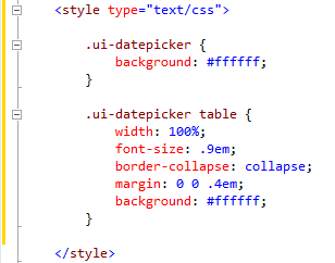
Add a <style> section to the head of your page and set it's type to "text/css".
The base reference for the Datepicker is ".ui-datepicker{}". You can either style this reference alone for a broad styling of the datepicker, or you can be more specific in your stylings. i.e. ".ui-datepicker table{}".
For example: When you first add the Datepicker to the page, its background will be completely transparent.
If you wish to change this simply add the background property and choose a color. The first example changes the background of the entire Datepicker to white.
The second example changes the table section of the Datepicker to white, and also changes a couple of other properties.
.ui-datepicker{
background: #ffffff;
}
.ui-datepicker table{
width: 100%;
font-size: .9em;
border-collapse: collapse;
margin: 0 0 .4em;
background: #ffffff;
}
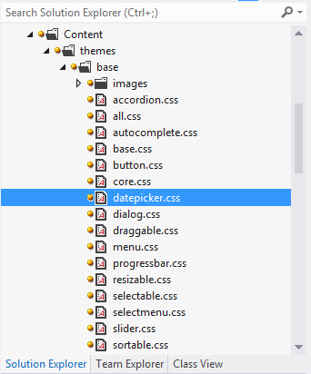
For a full list of all the parts of the Datepicker you can style, you can open up the "datepicker.css" file found in the "Content" folder of your project.
Full Path: [Project Name] > Content > themes > base > images > Datepicker.css